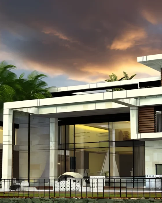
This building has a dining room at ground level and another one on the roof, and the elevation had to introduce both at the same time. The slatted canopy is the piece that does it.
The signage sits at the roof line rather than over the door. There is a reason for that.
Context and Materiality
A restaurant with a roof terrace has a recruitment problem: nobody at street level can see the best part of it. The canopy over the ground floor is angled and slatted, which lifts the eye along it rather than stopping it, and the terrace balustrade above is left open enough that the parasols and the furniture are visible from the pavement. Warm light is set into the underside of the canopy, so the ground floor gets a bright horizontal band while the roof stays cooler and reads against the sky.
Interior Atmosphere
The ground floor is almost entirely glazed, with the frames kept dark and thin, so the interior lighting and planting become the facade at night. Nothing is applied to the glass - no vinyl, no menu boxes - which keeps the view in clean and means the room itself does the advertising. The sign sits at the roof line, above the terrace, because that is the height at which it is read from a distance and from a car. At walking pace you do not need it. The open front and the lit canopy have already told you what the building is.
Published in Journal • Mar 2026